
What Is VWAP and How to Use It (Without Fooling Yourself)
The volume-weighted average price is the fair-value line day traders and desks lean on. Here is where it earns its keep, and where beginners quietly ruin it.
A short, honest shortlist of the candlestick patterns worth knowing, plus the blunt truth about why none of them work on their own.

Somewhere in your trading education you probably saw the poster. A hundred candlestick patterns in a neat grid, each with a name like "Three Advancing White Soldiers" or "Abandoned Baby," each promising to reveal what the market is about to do. It looks like a cheat sheet. It is closer to a distraction.
Here is the honest version. The most reliable candlestick patterns are a short list you can count on one hand, and even those only work when the trend and the level agree with them. The other ninety are variations, edge cases, and marketing. This piece is the shortlist plus the part nobody prints on the poster: the context that makes a candle mean anything at all.
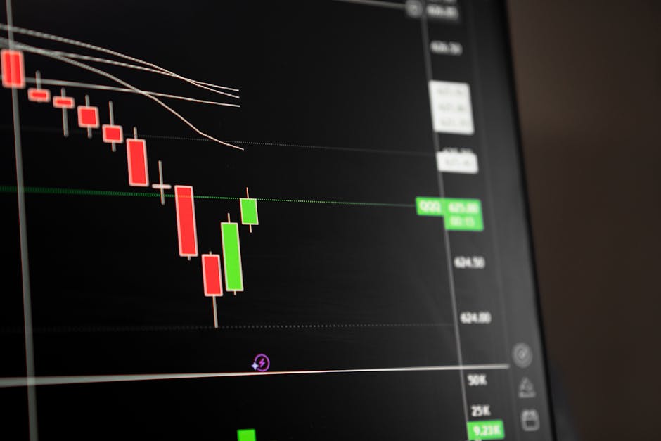
Before the patterns, the basics, because half the mistakes come from forgetting them. A single candle records four prices over one period: open, high, low, close. The body is the distance between open and close. The wicks are the extremes price reached and then gave back.
That is the whole information payload. A long lower wick means price dropped and buyers pushed it back up. A big body with tiny wicks means one side ran the entire period. If you are fuzzy on the mechanics, how to read a candlestick chart covers the ground properly.
Every named pattern is just a story about who won the fight over one, two, or three bars. Once you see them that way, you stop memorizing names and start reading intent.
Three patterns do most of the honest work. Learn these and you have covered the situations that actually repeat.
An engulfing candle is a bar whose body completely covers the previous bar's body in the opposite direction. A bullish engulfing closes above the prior candle's open after opening below its close. The bearish version is the mirror image.
Why it earns a spot: it shows a clean handover. One period the sellers were in control, the next period the buyers erased all of that and then some. That is a real shift in pressure, not a subtle hint.
What makes it worthless: an engulfing candle floating in the middle of a range. Price chops back and forth there, and every other bar engulfs the last one. The pattern only carries weight when it forms at a level price actually cares about.
A pin bar (sometimes called a hammer or shooting star depending on direction) has a small body and one long wick, usually at least two thirds of the candle's range. The long wick is the story: price went somewhere, got rejected hard, and closed back near where it started.
A pin bar with the wick pointing down, sitting on support, is buyers stepping in and refusing to let price go lower. That is worth noticing. The same candle in open air is just a wick.
The pin bar is probably the most abused pattern because the long wick looks dramatic on the chart. Drama is not signal. A rejection only matters when it rejects a level that mattered before the candle formed.
An inside bar is a candle whose entire range fits inside the previous candle's range. High is lower, low is higher. It looks boring, and that is the point. An inside bar is a pause. The market took a breath.
Inside bars matter because a pause after a strong move often precedes the next move. Traders watch for a break of the inside bar's high or low to signal which way the pressure resolved. It is less a reversal signal and more a coiled-spring setup, which is why it pairs well with trend rather than against it.
One honest caveat: inside bars produce a lot of false breaks. The bar breaks one way, sucks traders in, then reverses. Use them as a heads-up, not a trigger you fire on blindly.
Here is the uncomfortable truth that makes the other ninety patterns beside the point. No candlestick pattern works without trend and level behind it.
Run the test yourself. Take a bullish engulfing candle. In an uptrend, forming at a support level that has held before, it is a reasonable place to think about a long. Take the identical candle, same shape, same size, and drop it into a downtrend at no particular level. Now it is noise. Same pixels, opposite meaning.
The candle is the last word in a sentence the trend and the level already started. On its own it is a word with no sentence around it.
This is why memorizing a hundred patterns is a trap. You end up pattern-hunting, spotting a "Bullish Harami" here and a "Piercing Line" there, forcing trades because you found a shape. The shape was never the edge. The context was.
| Ingredient | What it answers | Where to learn it |
|---|---|---|
| Trend direction | Are you trading with the flow or against it? | Trend following strategy explained |
| A level that matters | Is the candle forming somewhere price has reacted before? | Support and resistance in trading |
Get those two right and a plain engulfing candle becomes useful. Get them wrong and no pattern on the poster saves you.
If three patterns do the work, why does every book list a hundred?
Because names are cheap and lists sell. It is easier to publish "50 Candlestick Patterns Every Trader Must Know" than to explain that you need three of them plus a working read of trend and structure. The long list also gives beginners a comforting feeling of completeness. It feels like knowledge. Most of it is not.
Dig into any of the exotic three-candle patterns and you find the same two ideas underneath: a rejection of a level, or a shift in momentum. The "Morning Star" is a rejection dressed up over three bars. The "Three White Soldiers" is momentum with a costume. Learn the underlying ideas and the encyclopedia collapses into a pamphlet.
There is a real cost to the long list too. It nudges you toward using too many signals at once, which usually makes decisions worse, not better. If that sounds familiar, how many indicators should you use is worth a look.
A workable process, stripped down:
That last point matters more than the pattern. A great candle with a reckless stop is a losing trade waiting to happen, and even the best setups fail often enough that risk management in trading is what keeps you in the game. A common rule of thumb is risking roughly one percent of the account per trade, not because it guarantees anything, but because it means no single wrong read ends you.
If you want to know whether a pattern helps you specifically, do not trust a book's claim. Test it. Scroll back through historical charts, or use replay, and count how a given setup would have played out with your rules and your levels. You will learn more from fifty of your own examples than from any list of named patterns.
One honest note before you do: past behavior on a chart never guarantees future results, and it is easy to fool yourself by only counting the winners. Count everything. How to backtest a strategy on TradingView walks through doing it without cherry-picking.
Print this instead of the poster: engulfing, pin bar, inside bar. Three patterns. Each one is a tiebreaker, not a signal, and each one is worthless without a trend and a level behind it.
The next time you catch yourself scanning for a "Dragonfly Doji" or a "Gravestone," stop and ask the only two questions that matter. What is the trend, and is this candle forming at a level price has respected before? If you cannot answer both, there is no trade, no matter how pretty the candle. The pattern was never the edge. It was the punctuation at the end of a sentence the market had already written.
The volume-weighted average price is the fair-value line day traders and desks lean on. Here is where it earns its keep, and where beginners quietly ruin it.

ATR does not tell you where price is going. It tells you how far it usually travels, and that is exactly what you need to set stops and size positions that fit the asset.
ADX tells you how strong a trend is, not which way it points. Here is how to read it without fooling yourself.