
What Is VWAP and How to Use It (Without Fooling Yourself)
The volume-weighted average price is the fair-value line day traders and desks lean on. Here is where it earns its keep, and where beginners quietly ruin it.
Every candle is a record of a fight between buyers and sellers. Here is how to read who won, and which patterns are actually worth your attention.

Open a price chart for the first time and it looks like a wall of colored bricks. Red ones, green ones, thin lines poking out the top and bottom. It seems like a lot. It is not. Once you learn how to read a candlestick chart, every one of those bricks becomes a short story about who was in control and who blinked.
A candlestick is just a compact way to show four prices over a set period: where price opened, where it closed, the highest it reached, and the lowest. That is the whole idea. A single candle can cover a minute, an hour, a day, or a week, depending on the time frame you pick. Learn to read one candle and you can read a thousand of them.
Let's take a candle apart.
Every candle has two parts: the body and the wicks.
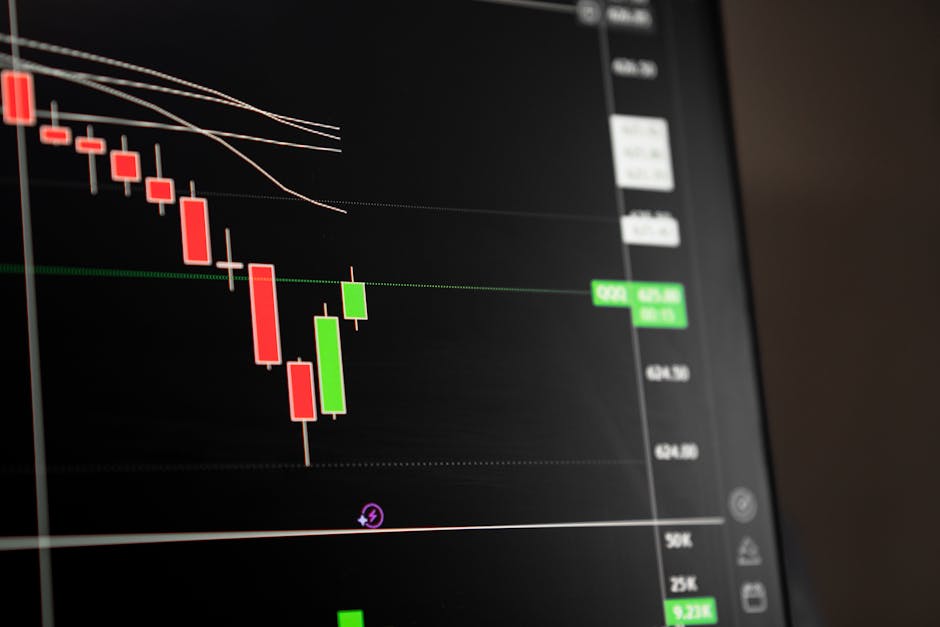
The body is the thick rectangle. It stretches between the open and the close. If price closed higher than it opened, the candle is usually green (or white) and we call it bullish. If price closed lower than it opened, it is usually red (or black) and we call it bearish. That's the net result of the period in one glance.
The wicks, sometimes called shadows or tails, are the thin lines sticking out of the body. The top wick marks the highest price touched during the period. The bottom wick marks the lowest. They show you where price tried to go and got pushed back.
Here is the mental model that makes all of this click. A candle is a tug-of-war between buyers and sellers over a fixed slice of time. The open is where the rope started. The close is where it ended. The wicks are how far each side dragged it before losing ground.
| Part of the candle | What it tells you |
|---|---|
| Body | The net move from open to close |
| Green/white body | Buyers finished in front |
| Red/black body | Sellers finished in front |
| Upper wick | How high price reached before getting rejected |
| Lower wick | How low price reached before getting bought back |
One quick warning: colors are a convention, not a law. Some charts flip them, and plenty of tools let you set your own. Always confirm which color means what before you read too much into it.
The size of the body and the length of the wicks tell you about conviction, not just direction.
A long body with tiny wicks means one side ran the whole show. A long green body says buyers pushed from open to close with barely any pushback. That is strength. A long red body says the same for sellers.
A small body with long wicks means a fight with no clear winner. Price got yanked up and down but ended near where it started. That is indecision, and indecision often shows up right before a move changes character.
Wicks are the part beginners overlook, and they are usually the most honest part of the candle. A long lower wick means price fell hard and then buyers stepped in and hauled it back up before the close. Somebody wanted those lower prices. A long upper wick is the reverse: price spiked and sellers slapped it back down. That rejection is information.
You do not read a candle to predict the next one with certainty. You read it to understand the balance of pressure right now. That is the whole game with price action, and it pairs naturally with knowing where the important price levels sit.
There are dozens of named candlestick patterns. Most of them are trivia. A small group actually earns its keep, and they all come straight from the body-and-wick logic you just learned.
A doji has almost no body. Open and close land in nearly the same spot, so it looks like a cross or a plus sign. It is pure indecision. Neither side could close the period in their favor. On its own a doji means little, but after a long run it can be the market catching its breath before turning. We go deeper on this one in what is a doji candle.
A hammer has a small body up top and a long lower wick, like a mallet. It shows price got sold down hard, then buyers reclaimed most of the drop before the close. Show up after a decline, and it hints that sellers are running out of steam.
Flip the hammer over. Small body at the bottom, long upper wick. Price rallied, then got rejected and sold back down. After an uptrend, it suggests buyers pushed too far and lost the ground they took.
This is a two-candle pattern. A bullish engulfing is a green candle whose body completely swallows the red body before it. It says buyers didn't just win the period, they erased the last one. The bearish version is the mirror image. Engulfing candles are worth watching because they show a clear shift in who is in charge.
Here is the part nobody tells beginners plainly: a pattern only means something in context. A hammer in the middle of a sideways chop is noise. The same hammer at a level price has bounced off three times before is a genuine tell. Location does most of the work. If you want the short list without the padding, the most reliable candlestick patterns covers the ones actually worth memorizing.
A candle on a 1-minute chart and a candle on a daily chart look identical, but they are not equal. The daily candle is the summed decision of everyone who traded that whole day. The 1-minute candle might just be one large order twitching the price.
Higher time frames carry more weight because more participants shaped them. That does not make lower time frames useless, but it does mean a beautiful pattern on a fast chart can vanish into randomness. If you are just starting, read the higher time frames first to get the lay of the land, then zoom in. Picking the right one is its own skill, and the best time frame for bitcoin trading walks through how to think about it.
Reading candles is a muscle. You build it by looking at a lot of them with intent, not by memorizing a glossary.
Try this. Open any chart and go candle by candle:
Do that for fifty candles and you will start to feel the rhythm of a chart instead of decoding it one brick at a time. Most charting platforms have a replay mode that lets you step through history bar by bar, which is the closest thing to reps without risking a cent.
A quick honest note: reading candles well does not remove risk. Even a textbook pattern fails plenty of the time, which is exactly why position sizing and a stop matter more than any single candle.
Candles are the raw material. Indicators sit on top of them and try to summarize what the candles are already telling you. A moving average smooths the closes. An oscillator like the stochastic reworks recent highs and lows into a single line. None of them replace the ability to look at a bare chart and read the pressure yourself. That skill is the foundation everything else is built on.
Color tells you whether price finished higher or lower than it opened over that period. Green or white means the close was above the open, so buyers ended in front. Red or black means the close was below the open, so sellers did. The colors are a convention and can be changed in most tools, so confirm which is which before you trust the read.
The body is the thick part, drawn between the open and the close, and it shows the net move. The wicks are the thin lines above and below, marking the highest and lowest prices touched before the candle closed. A long wick means price went somewhere and got rejected back to where it ended.
A handful. Doji, hammer, shooting star, and engulfing candles cover most of what beginners need. Memorizing dozens of rare patterns is a distraction. Patterns are hints about pressure, not signals to trade blindly, and they matter far more at support, resistance, or the end of a strong move than in the middle of chop.
The shapes read the same on a 5-minute chart and a daily chart, but higher time frames carry more weight because more participants shaped that candle. A pattern on a weekly chart reflects a week of decisions. The same shape on a 1-minute chart can be noise, so beginners are usually better off starting higher and zooming in later.
The volume-weighted average price is the fair-value line day traders and desks lean on. Here is where it earns its keep, and where beginners quietly ruin it.

ATR does not tell you where price is going. It tells you how far it usually travels, and that is exactly what you need to set stops and size positions that fit the asset.
ADX tells you how strong a trend is, not which way it points. Here is how to read it without fooling yourself.